Spreadsheets are powerful tool but, as all of us know, it takes skill and knowledge to use them well. It’s common to be sitting in front of rows of data and thinking to yourself, “I know there’s a way to do the thing I want to do, but I just don’t know how.” Google Sheets quietly launched a new feature last year called Explore and it’s designed to help with this problem. Think of Explore as a Spreadsheet Sorcerer standing next to you, giving advice.
This article will give an overview of how to use Explore and some examples for how it can make your life easier. To really dig in and see what Explore can do, however, I recommend actually playing around with it. If you don’t have a spreadsheet handy that you use often, you can make a copy of my demo spreadsheet and start trying out different Explore features.
Viewing the Explore Sidebar
The Explore feature can be accessed with a keyboard shortcut (Alt + Shift + X) or by clicking the Explore Button in the bottom-left hand corner of the screen:

Either the shortcut or the Explore Button will open up the Explore Sidebar, which is divided into different cards.

If you look closely at your data set, you’ll see that your data has a subtle green border and the column and row headers have a green tint; this is Explore’s way of telling you what data it’s looking at. You can highlight data manually, but as long as your data is in a clearly defined table with headers, Explore usually does a good job of finding it.

We’ll go through the different cards that are visible in the Explore sidebar, working from top to bottom.
Data Summary
When you highlight a batch of data, Explore can give you some basic summary information like maximum, minimum, sum, average, and count. This is, by far, Explore’s least useful feature because Sheets already give you this information, right next to the Explore button:

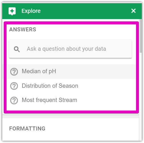
Answers
Ok, this is where Explore starts to get useful. In the ‘Answers’ card, you can type in a question about your data and Sheets will do its best to answer that question. As you can see in my example below, Sheets already has spotted some interesting data trends that I might be interested in, such as the “Median of pH” or “Distribution of Season”.
If I click on ‘Distribution of Season’, Sheets does a bunch of math in the background to count up how many observations were made in each season.

If I actually want to know what formula Sheets used to come up with these totals, I can click on “See Formula”, and it will show me the background math:

Now, let me just pause right here and point out that this is amazing. I can type in something like “What’s the most frequent sampled stream?” and Sheets will tell me the answer is “Flat Creek” with 51 samples AND show me the formula I can use to get that answer:
{"Stream","Count";ARRAY_CONSTRAIN(SORT({UNIQUE(LOWER(FILTER(D2:D123,D2:D123<>""))),ARRAYFORMULA(COUNTIF(D2:D123,SUBSTITUTE(SUBSTITUTE(UNIQUE(LOWER(FILTER(D2:D123,D2:D123<>""))),"*","~*"),"?","~?")))},2,FALSE,1,TRUE),1,2)}
Now, I fancy myself pretty handy with Sheets, but Ima be honest: I could not have written this formula on my own. I won’t pretend that Explore can answer every question you have about your data, but it’s pretty impressive what it will understand. The best part of the Answers feature is that you can use these ridiculous array formulas that Explore generates, then pass them off as your own when showing a spreadsheet to your boss: “You mean you’ve never used Array_Constrain before? It’s an old standby, I use it every week.”
Formatting
Explore’s formatting card is short and sweet, but it does one super-useful thing: it will format alternate colors for your data rows.
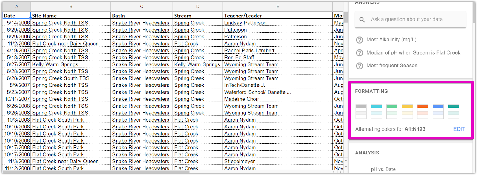
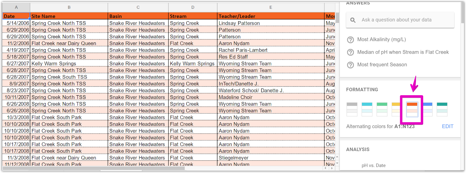
The formatting is persistent too, so if you delete an odd number of rows, you won’t end up with adjacent rows that are the same color. If you click on ‘EDIT’, you can pick custom colors and, say, give your data TSS brand colors (which, unfortunately, doesn’t look that great).

Analysis
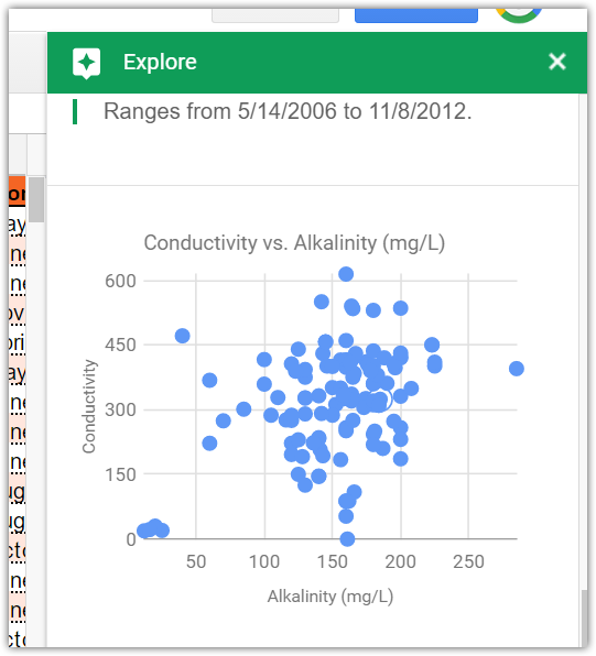
Explore will also recommend eight charts that you could create using your data. I’ve found the results to be mixed, but there’s almost always at least two charts I’d want to actually use. You can click on the charts and browse through them. If you see one you like, click the “Insert Chart” button to add it to your spreadsheet.
In summary, there’s nothing that Explore can do that you can’t already do using existing tools like Pivot Tables or Array Formulas. Explore’s value is that it just makes these existing tools easier to use. Explore can help you squeeze useful trends and summary information from your data without having to become a Spreadsheet Sorcerer.