Unlike desktop applications like Microsoft Word, Google Workspace apps like Docs, Sheets, and Slides draw typefaces from a central repository of web fonts. The biggest advantage of managing fonts this way is that you can always be sure that your documents will look exactly the same, no matter who's viewing the document.
This isn't the case for Microsoft Word, and it's one of the most common frustrations with traditional desktop design software: if you move your project to another computer or email it to a collaborator, the recipient needs to have the same fonts installed on their computer. If the new computer doesn't have those same fonts, your project won't look the same. As an example, let's say you create a carefully-designed resume like this:
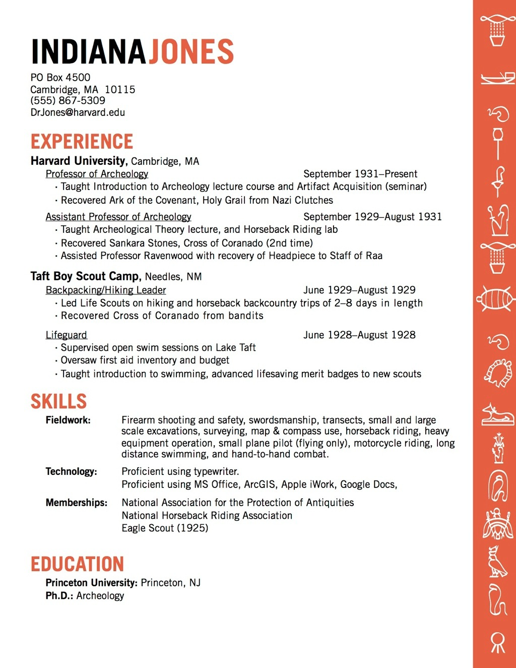
But then you send that same Word document to an organization where you've applied for a position. If the HR director doesn't have the same custom fonts installed on their computer, you'll get something like this:
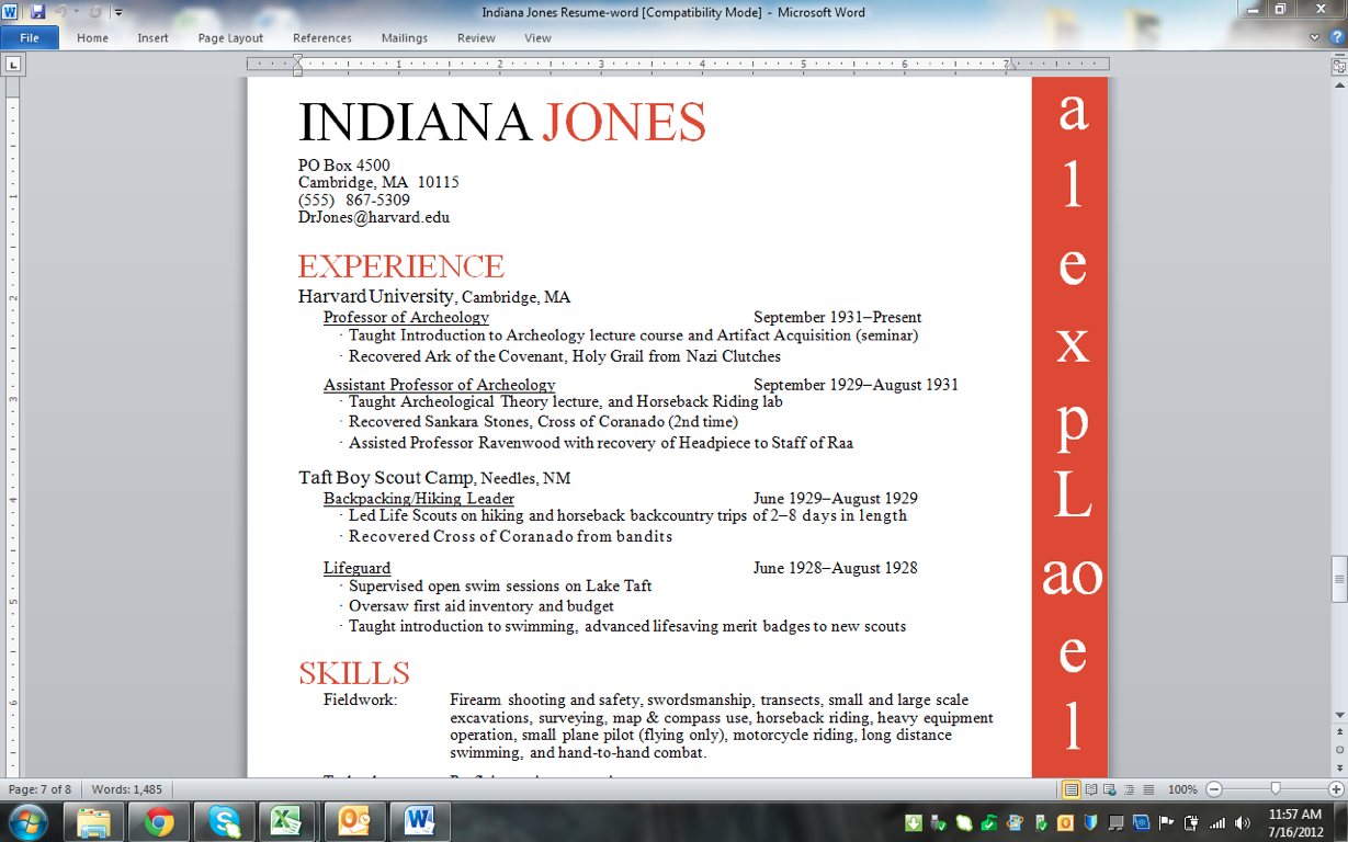
It looks totally different! You don't have this problem with Google Workspace apps, since they all pull their fonts from the same place. When you open a Google Doc on any computer, it doesn't matter what fonts you've already installed. Google Workspace just goes to fonts.google.com and grabs the fonts it needs to display the document.
In this guide, I'm going to cover some of the best ways to search, select, and use the 800 (and counting) different web fonts that Google makes available. We're also going to cover some answers to frequently-asked questions about Google web fonts and I'll share some recommendations for fonts to use. This article was inspired by this blog post by Eric Curts; I highly recommend taking a look at some of his recommendations and suggestions.
Viewing Available Fonts
You probably already know that you can view available fonts in Google Workspace apps by clicking on the font tool in the formatting tool bar. You'll get a list of your most recently-used typefaces at the top, followed by a list of every other typeface you've 'installed'.

If you select 'More fonts...' at the top of the list, you'll be able to browse through all of the available web fonts that Google has made available. Fonts that are available in your menu ('My fonts') are shown in blue with a checkmark; they also appear in a list on the right.

For today, however, we're not going to use this in-document font selector. Instead, we're going to head over to fonts.google.com to pick our fonts. This online font directory is a more full-featured menu of typefaces, especially if you don't know exactly what you're looking for. Fonts.google.com gives you more sorting and viewing options for browsing web fonts, so it's my preferred tool when I don't have a specific typeface in mind for a project.

The interface is beautifully designed, with a menu bar up top, font previews in the main body of the page, and search options in between.

If you want to change the overall theme of the fonts directory, you can click on the sun icon in the menu bar to toggle between light and dark mode


A Gentle Introduction to Typeface Classification
At time of writing, Google Fonts has 1462 different typefaces available. In order to find that perfect typeface for an upcoming project, we need to bring some order to that monstrous pile o' fonts.
The search options allow you to filter your search. You can choose which of 5 categories you'd like to include in your search.

If you're not familiar with these five typeface classifications, here's a quick primer:
- Serif- The letters in these typefaces have tiny little feet (serifs) on the bottoms of most letters. In addition, serif typeface letters with ascenders (the vertical lines that make up letters like l, d, h, and b) have little hats on the top of each ascender. Serif typefaces are often used for headers or for body text. Examples from Google Fonts include Libre Baskerville, Roboto Slab, and EB Garamond. Serif typefaces can be further divided into oldstyle, transitional, modern, and slab serif families; if you see one of those words in a typeface's name (like Joesfin Slab or Noto Serif), that's a clue that you're dealing with a Serif typeface.

- Sans Serif- Sans is French for 'without'. In contrast to Serif typefaces, sans serif typefaces don't have the little feet on the bottom of their letters. They tend to also be monoweight, meaning that letter thickness (also called stroke) is consistent through each letter. Examples from Google fonts include Roboto, Open Sans, and Noto Sans. Sans Serif typefaces come in several sub-families if you want to further down this rabbit hole: Grotesque, Neo-Grotesque, Humanist, and Geometric.

- Display- These typefaces are mostly for headings or signage. I've also heard them described as Decorative fonts. Display fonts aren't usually well-suited for long passages of text; they're best for attention-grabbing mastheads and headers. Examples: Lobster, Patuna One, Poiret One.

- Handwriting- Also called Script typefaces, these examples are all meant to look like someone could have written them by hand. Like Display typefaces, these aren't a good choice for extended paragraphs of type. They're better used for emphasis (say, to highlight a quote) or for headers. Examples: Dancing Script, Amatic SC, Permanent Marker.

- Monospace- In a monospace font, each letter is the same width as every other letter. This gives monospace typefaces a robotic or typewriter-esque feel; they're often used to provide contrast to computer code that's embedded in a document. Of Google's 800+ fonts, only 30 are classified as monospace. Examples include Curtive Mono, and VT323.

Other Searching Options
You can also use the Google Fonts sidebar to search for specific fonts by name, of course. There are a number of other properties, such as thickness, language, or slant that are pretty self-explanatory. You just select the check box next to the option you want to use, then move the slider back and forth to adjust that search attribute.

That top option, 'Number of styles', deserves a little more explanation. Many typefaces come in different weights (letter thickness), along with bold or italic versions. For example, the Roboto typeface comes in 6 different weights ranging in thickness from Thin up to Black:

Each of those weights comes in two varieties: standard and italics. Using different styles of the same typeface is an effective way to add contrast to a document, particularly one with a hierarchy of headings and titles (like a resume or a handbook). Having more available styles doesn't make one typeface better than another, but it does give you more options for varying degrees of contrast. If you're creating a project like a resume, it can be helpful to limit your search to typefaces that come is multiple weights.
Also, if you know that your project is going to involve a lot of italic type, it's good to seek out a font that has at least one italic style. While any font can be italicized by just slanting the letters, it's better to choose a typeface that actually has a separate set of glyphs (letter shapes) for italic type. As an example, look below at the comparison between Roboto (above, has an italic style) and Rozha One (below, does not have italic style). The lower typeface looks distorted when it's in italics because, well, it is distorted to slant the text.

Decisions, Decisions
Let's say you've narrowed your search down to a few options. You can use some of the display options in Google Fonts to get a better feel for how a given typeface will look. As you're browsing type samples, if you hover over any of the displayed fonts, some display options will appear. You'll be given the option to change the size and style of the type sample, as well as the kind of type sample you see. Do you want to see just numeric characters? How about a paragraph or a sentence? You can also type in your own custom text to see how it will appear.

If you click on the name of any font listed in Google Fonts, you'll be taken to its information page. You'll be able to see all of the characters for your chosen typeface.

Also you can view its different styles, play with it using the 'type tester', read a little 'biography' about the typeface, find statistics on its usage, and some suggestions for how to use it effectively.

So, You Found a Font...
If you found a font you'd like to use in the Google Font directory, you can go back to your doc/sheet/slide project and add it using the formatting toolbar. As we covered above, click on the font tool in the formatting toolbar and navigate to the bottom to click on 'More fonts".

You can then search for your chosen fonts by name. and add them to your font menu. Fun fact: once you've added a typeface to your font menu, it will appear as an option in all Google Workspace apps
Now, if you're interested in using your chosen typeface in a non-Google Workspace app, you can also download fonts from fonts.google.com for free. Since all Google web fonts are open source, they're free for anyone to use at no charge. If you want to use Roboto in a Microsoft Office document, for instance, you can download it or use an app like SkyFonts to allow local access to it.
Font Substitutions and Recommendations
So, first of all, our branding guidelines list three primary typefaces for brand-compatible publications: Museo Sans, Museo Slab, and Gesta Condensed. These are premium, licensed typefaces that aren't available in Google Workspace applications. The branding guidelines list two typefaces that should be used as backups: Arial and Times New Roman. While neither of these typefaces is an open-source web font (and thus not on fonts.google.com), you can still access both of them in Google Workspace apps.
If you're looking to for a free Google substitute for a licensed font, you can browse around inside the Google Fonts directory looking for something similar. I, personally, have had good luck with just doing a Google search, e.g. "Google font substitute for Avenir". This website is also an excellent resource for finding approximate Google stand-ins for premium fonts. I'll also list some of my favorite Google typefaces below, the ones I find myself using most often.
This geometric sans serif was commissioned by Google to be the standard typeface for the Android, as specified in the Material Design specifications. If you want your project to look 'Googley', Roboto's an excellent choice.

I started using this sans serif as a stand-in for my old standby, Trade Gothic. I like the tall letters and condensed, efficient use of space.

This is probably my favorite script typeface that Google offers. It's fun and informal, but also legible and not overly silly (like Comic Sans).

A solid, heavy display typeface. Also, come on, who doesn't like ceviche?

This is another sans serif that I like. I have an irrational fondness for oldstyle numbering (notice how the numbers 3, 4, 5, 7, and 9 have a lower baseline than the others?), which many designers hate.
